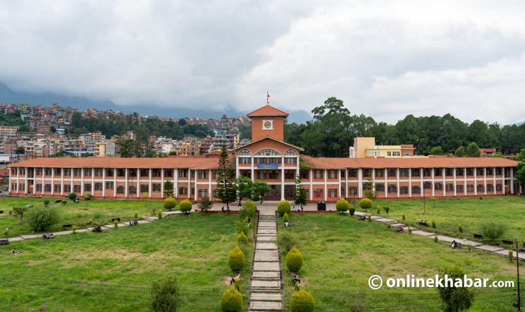

When the secretariat of the Visit Nepal 2020 campaign asked her company to brand the event, Marie-Ange Sylvain Holmgren and her staff were overwhelmed.
“People don’t realise that to design something simple is the toughest thing,” says Holmgren, pointing towards the Visit Nepal logo designed by her company Imageark. “When the secretariat asked us, we took a deep breath. We had been involved in various projects but this was something bigger than what we had ever done,” she says.
However having successfully rebranded entities like the Lalitpur Metropolitan City, Hotel Yak and Yeti and the Lumbini Museum, Imageark knew that it was not something out of their league.
The first thing her team did was single out interesting campaigns prepared by other countries. As a former communication person herself, Holmgren knew that the brand had to become a communication tool. That is why she asked her team to select campaigns which appealed to the audience. “We didn’t just want a graphic. We want it to be a communication tool, which is why we felt that the name of the country needed to be prominent.”
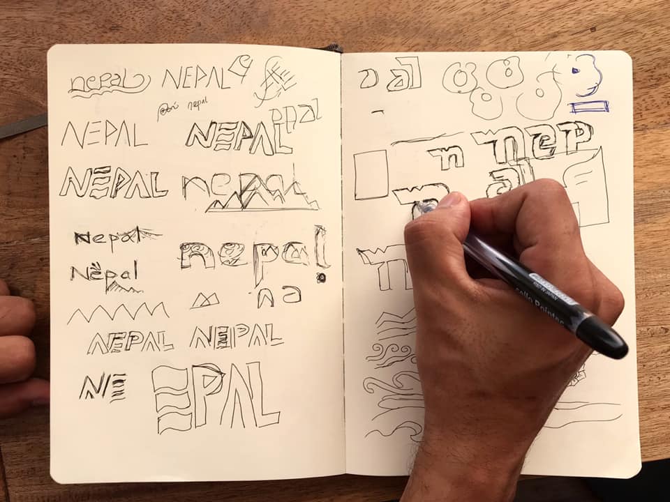
After going through various campaigns, Holmgren and her team realised that all successful campaigns had the name of the country highlighted extremely well. “It gives the campaign identity. The previous logo was good, but Nepal in that logo seemed like an afterthought.”
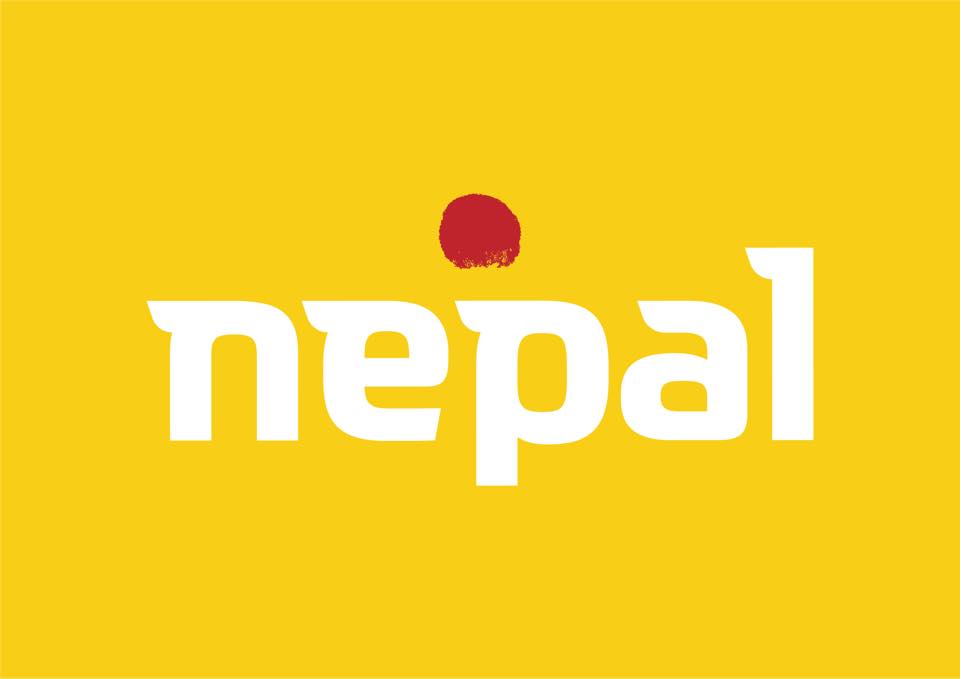
That is when they decided that ‘Nepal’ would be prominent and the whole identity of the brand would focus on Nepal. Along with the word Nepal, Holmgren also wanted to add another thing – a tika. “The first thing I realised after coming to Nepal was how everyone had a red dot on their forehead. That is why I wanted to include that because you see that everywhere. Tourists would definitely relate to this.”
Her team then suggested an added a layer of meaning to the tika. It would be the Dashain tika. Imageark’s art director Swojan Newa then suggested that the spaces in the tika didn’t look right. So they tried to do something more to it. He suggested that the spaces form Nepal’s flag to give it a nationalist touch.
“So if you look at it, the tika blesses Nepal. The tika is on Nepal and Nepal is inside the tika,” Holmgren explains.
The team then hand-drew the word ‘Nepal’, which according to Holmgren, took quite a while to finalise. After the typography was done, the team then wanted to do something different and be creative.
“Every time, we see tour promotions focusing on Nepal, we see red and blue. But we didn’t want to do that. We wanted to try something different, which is why we used yellow. Yellow is a prominent colour and is seen everywhere in Nepal. And luckily it’s a colour that at the moment is quite in too.”
After the logo was finalised, and the colour was decided, the team at Imageark then thought of adding patterns.
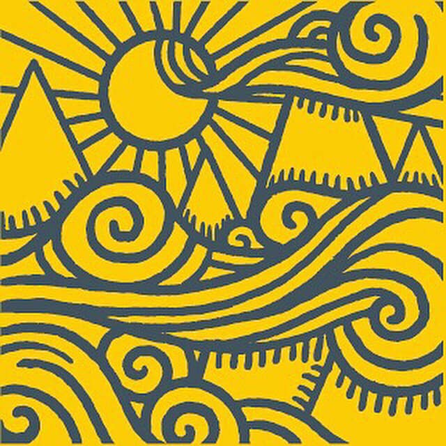
“We wanted to go an extra mile and do something unique. The patterns included things like rice terraces, bells, prayer wheels, prayer flags. These are things the tourist can connect to because they will see these patterns all over Nepal.”
After that, the team then created collaterals and designed maps, billboards, posters, cards and used the patterns.
“We’ve even created a design for Nepal Airlines. We made sure that Nepal Tourism Board had everything to promote Nepal. We suggested different ways they could use our design and patterns,” Holmgren adds.
She explains that a campaign is more than just a logo. It is something big, something that touches the audience which is why her team have also formed guidelines to teach people how to use the logo and the patterns they have created.
“Because a lot of people were going to use what we created, we had to do it. We want this campaign to be successful.”
Holmgren also adds that the government also takes ownership of the campaign. She shares that the Tourism Board and the Ministry has put a lot of trust in them. “They have understood what we’ve tried to do. They understood the thinking behind this brand and for us, that is huge if a client and you are on the same page.”
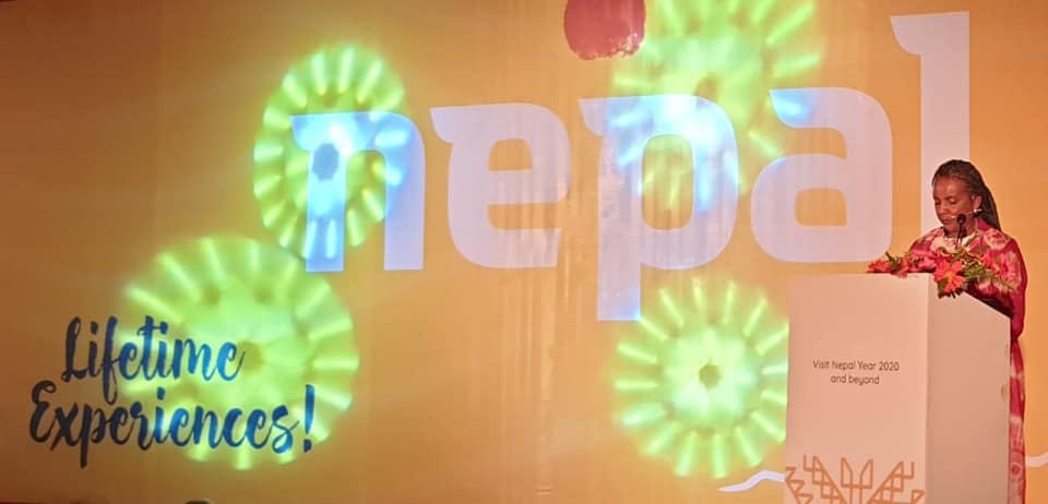
Holmgren shares that when they finished the 40-minute presentation, they weren’t entirely sure if the people from the Tourism Board would like what they had done. “They just wanted a brand, but we gave them an entire campaign. They were pleasantly surprised and clapped. It was a big relief because we feel this goes beyond Visit Nepal Year 2020.”
Photos: Imageark